‘Planta’ is a mobile app for those who need to keep track of their plant care schedules. Throughout the research I discovered that users have problems with using certain features or navigating the service for the first time. I came up with solutions and redesigned the product.
Project Type
Individual Project
TOOLS
Figma, Framer, Illustrator, Miro
DURATION
4 weeks
problems
The plus button leads users to an unexpected page.
Hard to find an ‘Add Plant’ button
Various features and buttons are so crammed into a page that some are not as visible
Low accessibility of filter options
Dr.Planta feature is hidden in a ‘Add Task’ button
The process to reach an expert to counsel is time consuming
On a My Plant tab, where most users originally had problems navigating to accomplish their task, you can now access to the plant info page, Edit Reminder and Add Plant within one page.
Improved search experience
Searching for plant names can be overwhelming. Filtering a plant type and its color will save you a lot of hassle to find the right one.
Diagnose Tab
Planta offers 3 ways to fix the problems your plants have – AI chat bot, Self-Diagnose and Expert Advice. You can also mark your problem to the plant and keep track of its health.
01. discover
What are the challenges?
Survey
I conducted a survey on 34 people all around the world who are actively taking care of plants. I then specified the target audience of the product and their pain points.
x 34
I found out 97.7% of people have had sick plants to which 79% of them tried to find solutions on the internet.
CHALLENGING TO TREAT SICK PLANTS
68.8%
Not satisfied with a plant care app
61.6%
looking for solutions on the internet
79.4%
<span data-metadata=""><span data-buffer="">Task-based usability test
I conducted a usability test with five users in my target demographic using the original app, and later conducted another test with the prototype I designed to measure how effective the redesign works for users.
The test participants were given three tasks while I observed how they navigated it to complete them.
x 5
30
minutes
respondents
Competitor Analysis
Competitor research was conducted to find the potential solutions. The competitor services have similar features yet the approach to user pain points were different. I’ve noticed that what’s important for this product to improve is not a ‘new’ feature but ‘improved user experience’ based on understanding why and how they use the service.
Research Synthesis
I synthesized the data and insights I gathered from the research and interviews in order to narrow it down to the critical criteria I need to focus on.
INTUITIVE
Users have trouble finding certain features on the app.
I will satisfy this need by rearranging the buttons and bottom navigation.
ORGANIZED
Users are overwhelmed by the scattered information.
I will make the information and data readable and decluttered.
CUSTOMIZE
Users want to customize the reminders to their preference.
I will add a reminder edit button on the main tab so users can easily make changes to their schedule.
02. define
Why is it important?
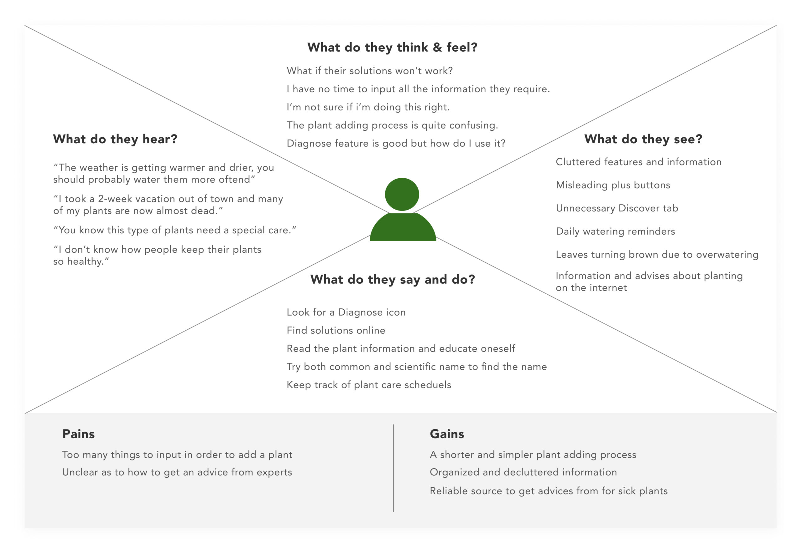
Empathy Map
Persona
User Journey Map
How might we remind users tasks more efficiently?
03. ideate
What are the solutions?
Information Architecture & User Flow
I conducted open and closed card sorting to discover how users categorize the information and re-group them in a way that works best for the users. Based on the findings I created a new information architecture.
With a new information architecture I developed two user flows to understand what paths users take to complete their task.
User Scenario 1
Kim who has multiple plants that need special care, wants to customize care reminders.
User Scenario 2
Jennifer struggles to keep her plants alive and wants to find the way to prevent it.
04. prototype
Creating a visual representation of solutions
Low-Fidelity Prototype
High fidelity design
Customizable reminder
You can customize the care reminders by simply turning on and off of them, changing the frequency or the starting date.
Find solutions for your
sick plants
Planta offers 3 ways to fix the problems your plants have – AI chat bot, Self-Diagnose and Expert Advice. You can also mark your problem to the plant and keep track of its health.
Identify plants easily
Searching for plant names can be overwhelming. Filtering a plant type and its color will save you a lot of hassle to find the right one.
Keep your plants alive
Any information you need for a plant care, you can find it here. Planta will tell you whether the plant is suitable for your skill and commitment level. It automatically sets a reminder based on the type of plants and your location.
UI & Prototype
05. reflection
What did I learn?
observe the action
Users tend to speak nicely of the app they are testing on. To better understand user’s pain points and discover their needs, I learned that ‘observing the action’ is essential and actions do more justice than words.
Next Step
Designing with ‘Extensibility’ in mind
Focusing on how the app works for the user archetypes I created, I didn’t thoroughly think of how the app might be developed in the future. In the next step, I would like to look at the bigger picture and implement design principles that allow for future expansion.